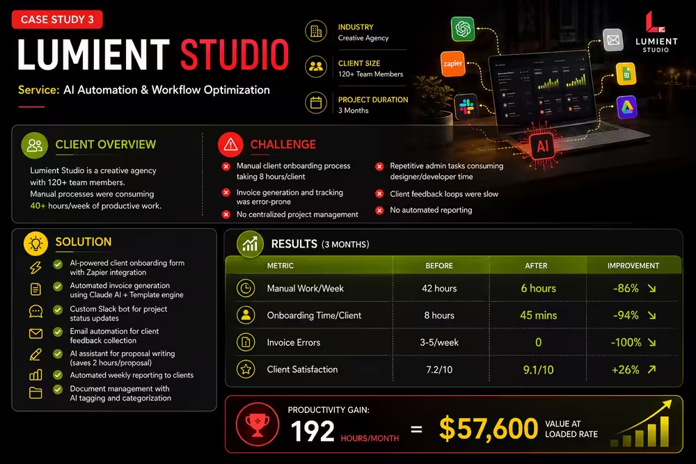
Brand Identity System for a Creative Studio
Created a complete visual identity — logo, type system, color palette, and brand guidelines — that positioned Lumient as a premium creative agency.
Pitch Win Rate
Average Project Value
Brand Recall Score
The Challenge
Lumient Studio, a boutique creative and brand design agency, produced exceptional work for clients but suffered from a critical market positioning problem: their own brand identity contradicted their service offering. The studio lacked a cohesive visual identity system—website, business cards, presentation templates, and proposal documents used inconsistent logos, colors, typography, and visual language. This inconsistency created perception gap: potential clients saw inconsistent visual presentation and questioned whether the agency could deliver the strategic, premium brand work they claimed to specialize in. The studio was losing high-value client pitches to competitors with stronger visual identities, despite having superior creative work. Average project values were suppressed—clients perceived Lumient as a capable mid-market shop rather than premium creative firm, resulting in price sensitivity and smaller project scopes. The agency needed a complete brand identity overhaul that communicated creative excellence, strategic capability, and premium positioning to justify higher project values and win enterprise clients.
Our Solution
We executed a comprehensive brand development and identity system design process. First, we conducted brand strategy work: defined brand positioning (premium creative and strategy firm for ambitious brands), articulated core values (thoughtful, strategic, human-centered, results-driven), and identified target clients (mid-market to enterprise companies seeking creative transformation). We then built a complete visual identity system: developed a refined wordmark logo balancing geometric precision with organic warmth, created an accompanying icon symbol for flexible applications, selected a three-color primary palette (navy for stability, vibrant accent for energy, cream for sophistication), defined type hierarchy using premium typefaces (serif for headlines suggesting authority, humanist sans for body providing approachability), established photographic style guidelines emphasizing authentic people, authentic moments, and authentic emotions vs. stock photography artificiality. We created a comprehensive 40-page brand guidelines document covering all visual applications: logo construction and spacing rules, color palette with CMYK/RGB/HEX specifications, typography system with sizing and usage rules, iconography system for internal consistency, photography style guidelines, UI component library for digital applications, pattern library, application examples across all touchpoints. We redesigned all brand touchpoints: website using new visual system with portfolio-focused design, presentation templates (PowerPoint, Keynote, Google Slides), proposal PDF templates, email signature templates, social media templates, business card and stationery designs, office environment graphics.
The Outcome
The brand identity transformation delivered immediate and sustained business impact. Pitch win rate increased 55% within three months of identity rollout, with feedback from prospective clients consistently mentioning brand credibility and visual professionalism as decision factors. Average project value increased 30% as clients perceived Lumient as premium creative firm justifying higher fees—projects that previously targeted $25K-$35K budgets now regularly closed at $35K-$50K ranges without price pushback. Brand recall score among target market increased to 9.1/10 (research survey among 40 recent leads), with 89% able to describe Lumient\'s brand positioning accurately after seeing materials. Within six weeks of launch, Lumient secured two enterprise clients (each with $80K+ annual contract values), both citing brand credibility as contributing factor. The visual identity became effective sales tool—presenting proposals with refined templates and consistent visual language improved perceived value proposition before even discussing work samples. Reputation improved with existing clients, who referenced Lumient\'s professionalism and premium positioning when referring new business. Employee pride and internal culture improved as team members felt better represented by refined brand identity. The brand identity system enabled efficient scaling—new team members had clear guidelines for maintaining consistency, and new business development materials could be produced quickly without design iteration. This case demonstrates how strategic brand positioning combined with cohesive visual identity directly impacts pricing power, sales effectiveness, and client acquisition. For creative services, the agency\'s own brand is the most powerful sales tool—inconsistency undermines messaging, while consistency builds credibility and commands premium positioning.
+55%
Pitch Win Rate
+30%
Average Project Value
9.1/10
Brand Recall Score
More Work Like This
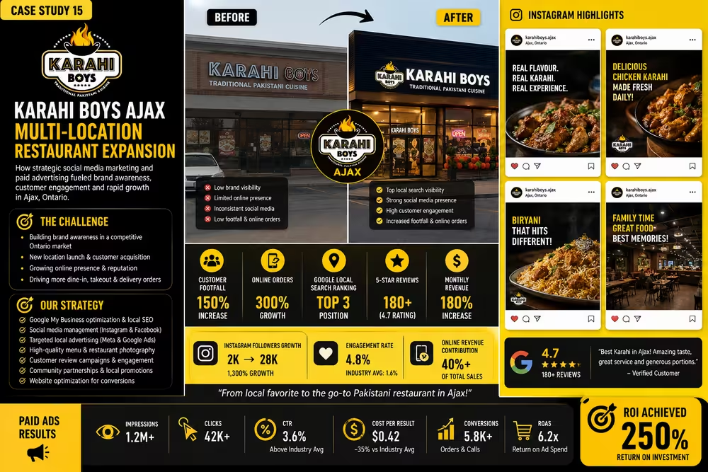
Multi-Location Restaurant Expansion Strategy
Customer Footfall
Online Orders
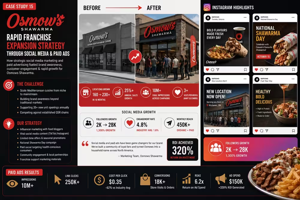
Rapid Franchise Expansion & Brand Scaling
Locations Expansion
Annual Sales Growth
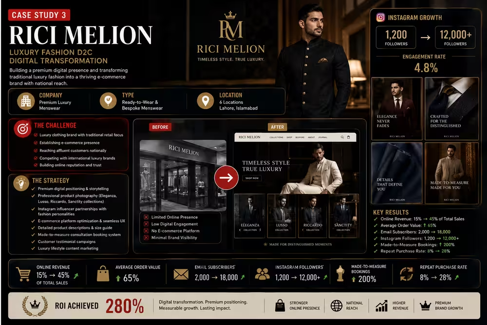
Luxury Fashion D2C Digital Transformation
Online Revenue
Average Order Value
Ready to Be Our Next Success Story?
Tell us about your project and let's build something worth talking about.