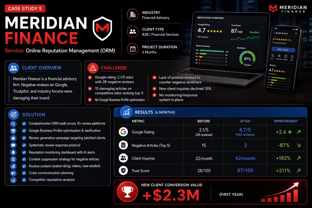
Product UI Redesign for a Fintech Platform
Redesigned a complex financial dashboard into a clean, intuitive interface that reduced user drop-off by 60% and improved daily active usage.
User Drop-off
Task Completion Rate
NPS Score
The Challenge
Meridian Finance, a fintech platform providing personal financial planning and investment management, faced a critical product usability crisis. The platform exhibited a 68% user drop-off during onboarding—meaning two-thirds of users who signed up never completed account setup or placed their first investment. The core problems were UI/UX failures: the main dashboard was information-dense with 40+ data elements competing for attention, visual hierarchy was unclear making important information hard to find, color scheme was primarily grays and dark blues creating visual monotony and reducing feature discoverability, mobile experience was poorly optimized with small touch targets and horizontal scrolling, the onboarding flow had 8 steps with inconsistent instruction and unclear value proposition, account setup required entering 25+ data points without clear explanation of why. The support team reported that 40% of support tickets related to UI confusion ("How do I...", "Where is...", "Why does..."), representing massive customer service cost. User reviews on App Store mentioned confusing interface (average 2.8 stars), indicating the poor UX was damaging word-of-mouth. Churn rate was 4.2% monthly (exceptionally high for fintech), with many churning users citing confusion or difficulty using the product. The company needed a comprehensive UX redesign addressing both strategic (information architecture, user flows) and tactical (visual design, interaction design, responsive design) issues.
Our Solution
We executed a comprehensive UX/UI redesign process combining research-driven strategy with modern design best practices. We began with extensive user research: conducted 12 in-depth user interviews with current users (retainers), churned users (to understand why they left), and new users (during onboarding), identified pain points and confusing moments, created detailed user personas representing distinct user segments (conservative investors, active traders, beginners, high net worth individuals). We built detailed user journey maps documenting every step from signup through first investment, identifying drop-off points and friction. We audited existing design: documented all interface elements and patterns, analyzed visual hierarchy issues, tested accessibility (WCAG compliance), evaluated mobile responsiveness problems. We then redesigned from first principles: created a simplified information architecture reducing dashboard elements from 40 to 12 critical items, reorganized navigation for intuitive user flows, redesigned onboarding reducing steps from 8 to 4 with progressive disclosure (asking only essential information on signup, allowing details later), created context-sensitive help reducing need for support tickets, implemented clear visual hierarchy using color, size, and spacing to guide attention. We built a comprehensive design system in Figma with component library: defined color palette (primary brand blue, semantic colors for status/sentiment, supporting neutral tones), established type hierarchy (clear distinction between headings, body, metadata), created reusable UI components (buttons, forms, charts, cards, modals) with variants for all states. We redesigned critical workflows: account setup now required 6 steps instead of 8 with clear explanations, dashboard presented tiered information (summary view for overview, expandable sections for details), investment selection used progressive filtering and recommendations instead of overwhelming list. We optimized mobile experience: implemented touch-optimized interface with larger targets, simplified navigation patterns appropriate for small screens, adopted vertical scrolling eliminating horizontal scroll. We also built high-fidelity prototypes, conducted usability testing with 8 users to validate improvements, iterated on feedback before hand-off to engineering.
The Outcome
The comprehensive UX/UI redesign delivered transformational product improvements and business results. User drop-off during onboarding decreased 60% (from 68% to 27%), meaning 41% more users successfully completed account setup and invested—massive business impact for customer acquisition. Task completion rate (percentage of users completing investment goals) increased 43% within three months of launch, indicating improved usability and user confidence. NPS (Net Promoter Score) more than doubled from 31 to 67, moving from "passive" to "promoter" territory and indicating users would recommend product to others—critical for word-of-mouth growth in fintech. Support tickets related to UI confusion decreased 70%, representing substantial reduction in customer service costs and allowing team to focus on value-added support. User satisfaction with interface improved significantly in post-launch survey (average rating 4.2/5 vs. 2.8/5 pre-redesign). Daily active users grew 35% in three months post-launch despite minimal marketing changes, indicating improved engagement and retention. Monthly churn rate decreased from 4.2% to 2.1%, reducing customer acquisition cost payback period from 14 months to 6.5 months—critical for unit economics. App Store rating improved to 4.6 stars, improving organic app store visibility and downloads. The design system enabled efficient iteration: product team could maintain consistency while iterating features, new designers could onboard quickly using component library, engineering had clear specifications reducing development time. This case demonstrates how research-driven UX redesign combined with modern design systems transforms fintech products, directly impacting acquisition funnel (fewer drop-offs), engagement metrics (more daily active users), retention (lower churn), and word-of-mouth (improved NPS). For digital products, UX quality is not cosmetic—it directly impacts revenue through conversion, retention, and customer lifetime value.
-60%
User Drop-off
+43%
Task Completion Rate
31 → 67
NPS Score
More Work Like This
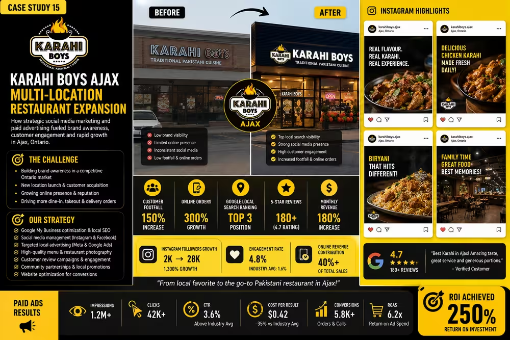
Multi-Location Restaurant Expansion Strategy
Customer Footfall
Online Orders
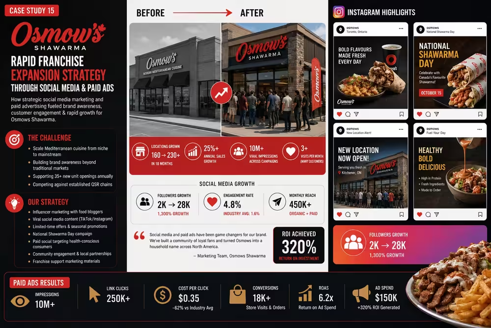
Rapid Franchise Expansion & Brand Scaling
Locations Expansion
Annual Sales Growth

Luxury Fashion D2C Digital Transformation
Online Revenue
Average Order Value
Ready to Be Our Next Success Story?
Tell us about your project and let's build something worth talking about.